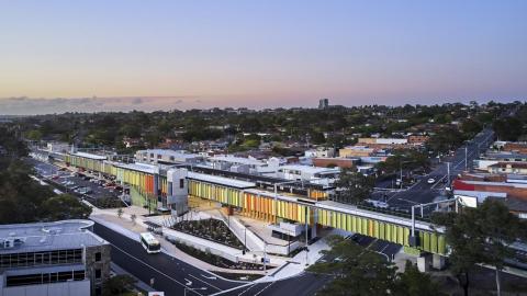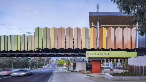
North Eastern Program Alliance, in collaboration with MGS and Jacobs Architects, have delivered a new station and urban precinct at the heart of Rosanna. The station and rail bridge were undertaken as part of the Victorian Government's Level Crossing Removal Project.
The station design, developed through a consultative process with the local community, incorporates bold applications of colour combined with a highly tactile material palette to create a strong sense of local identity whilst sensitively stitching the station into its context.
This sense of contextual connectivity and local amenity is emphasised further in the layout of the station, which is arranged to encourage both commuter and general pedestrian and cycle cross permeability through the precinct into the surrounding neighbourhood centre, and by dramatically framing views to the locally significant Rosanna Parklands from the key concourse areas on the approach to and exit from the station.
-
300
meters long
-
119
projects under the Victoria’s Big Build umbrella, which the Rosanna Station is a part of
Rosanna Station is a new rail station built as part of the Victorian Government’s Level Crossing Removal Project (LXRP). The project was delivered by the North Eastern Program Alliance (NEPA) made up of LXRP, Jacobs, Metro Trains Melbourne, Laing O’Rourke and Fulton Hogan. The precinct was designed in partnership between MGS and Jacobs Architects and NEPA, with landscapes by Outlines Landscape Architects.
The project delivers a new elevated station and rail bridge spanning Lower Plenty Road in the heart of Rosanna Village. The station and rail bridge are located within the core of the village and at the threshold to the locally significant Rosanna Parklands.
The station infrastructure, measuring some 300-meters-long, was a dramatic shift in scale from its fine grain and low height context. Despite this, we strove to create a solution that, although striking and memorable in expression, would resonate authentically with the community’s values, reinforce a local sense of place; to create a precinct connected to its community.
Our design approach specifically included:
- Arranging the station precinct to enhance natural wayfinding, permeability, connection to place and amenity for the user, expanding the role of the precinct beyond station to a public functionality that enhances local community convenience and amenity
- Developing an architectural language referential to the local Merchant Builders designs found nearby at Elliston Estate. This includes a deliberate structural expression, modesty of scale, natural textures and integration of built form with landscape
- Downplaying scale through stepped forms, streamlined structures, and the use of highly textured permeable materials that moderate views and temper the scale of the structures
- Inviting the community to articulate local value and translating this into design approaches for color and texture
- Utilizing topography to nestle the station infrastructure into its landscape setting
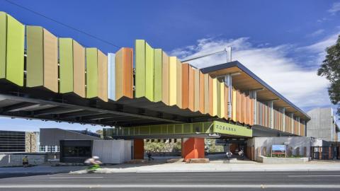
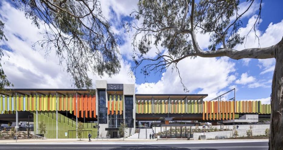
The most striking feature of the station is the ribbon like platform screens which are designed to ‘feather’ views to the platforms. The steel panels are painted in colors that reference the site’s ‘Bushland’ setting, a palette developed with community input. The ribbon stretches over Lower Plenty Road, visually drawing the parkland into the precinct, and is broken only by vertical lift structures that tie the structure to its terrain and act as informal urban markers for the gate line of the station.
Within the concourse spaces, rudimentary civil structures; concrete cross heads, super T beams and columns that support the rail and platforms, are carefully exposed. These elements express the permanence of the station but are layered with painted steel panels, and timber acoustic ceilings that soften and warm the concourse spaces. Similarly, the prefabricated station facilities building and retail kiosk, are given a sense of permanence through textured concrete cladding in dialogue with the lift cores, and articulated with robust timber sleepers. The concourse opens up to the surrounding tree canopies to continually reinforce connectivity to its landscape setting.
Anecdotally, in and around the completed station precinct, we have consistently heard positive feedback from locals who are proud of their new station.
Colorbond Award for Steel Architecture Statement
Steel was used extensively through the project to take advantage of its inherent capacity for prefabrication and transportability of large portions of the structure for fast assembly on site, critical to minimize the impact of construction on commuters.
As well as this practical need, we were keen to also use steel expressively through the station precinct. Each side of the station presented differing opportunities and challenges. The eastern façade is made up of brightly colored vertical steel slats that reference the ‘bushand’ setting of the locality as well as softening this long façade. The western façade, directly addressing existing apartment buildings is expressed with a Colorbond clad acoustic panel designed to provide privacy and acoustic protection to nearby neighboring residents from rail and station activity. This façade is articulated with colored fins that render the façade brightly in oblique views whilst being more subtle from direct views from residents.
Sustainability Statement
Whilst the project meets the usual performance benchmarks, distinctive innovation came through two core approaches.
Firstly, a deeply collaborative approach between building and rail design teams resulted in the multi-purposing of overhead power/catenary structures to double up as platform canopy supports. Traditionally these would be constructed as entirely separate structures which result in less efficiency and dramatically more visual clutter.
Secondly, the project team recognized that such a significant, large scale project, beyond being an important piece of public transport infrastructure, needed to positively contribute to the community fabric and social sustainability of the local Rosanna neighbourhood. Through consultation, Rosanna locals participated in some aspects of design approach and resolution. Notably, color and material themes were developed through these engagement processes. We believe this approach; both dialogue and outcomes, have helped to bolster a sense of ownership by the local community, contributing to a long lasting, socially sustainable precinct.


